
Pharmaceutical Analytics - the custom dashboard layer over an analytics consultancy’s operational data
A two-surface build for a pharmaceutical-analytics consultancy: a public marketing site that sells the service, and a private per-client dashboard that delivers it - supplier intelligence, company-lifecycle tracking, timeline analysis across millions of records, presented as decisions a client can act on rather than a spreadsheet they have to interpret. The reference build for any vertical where the answer the buyer wants is the dashboard, not the data.
Live: pharmaceutical-analytics.com
The brief
The consultancy sat on a large analytical estate - supplier records, company-lifecycle events, manufacturing footprint, regulatory submissions - enriched daily through a pipeline of extractions, transformations, and validations. The data was good. The question of what to show to the partner who’s paying for it was the unsolved part. Every engagement was ending in a Word document with screenshots from a tool the client couldn’t open later, or a sharing link that broke when a column renamed, or a workbook the client couldn’t open without a licence. The analyst knew the answer; the partner couldn’t see it without the analyst sitting next to them.
What the consultancy wanted was the dashboard as the deliverable. A custom surface where the per-client view of the data is exactly what their decision-makers need - not the generic tool’s view, not the consultancy’s internal view, not the analyst’s working notes. The build had to handle the shape of the dataset (large-scale timelines, supplier-comparison joins, alert generation), present it the way a pharma operations director recognises their world (manufacturing sites on a map, supplier-relationship timelines as horizontal bands, alert-feed as a triaged stream), and stay coherent as the underlying schema evolves with the consultancy’s research direction.

What it actually does
The public site. A fast, indexable marketing surface. It positions the service, lists the offer shape, and routes enquiries into the consultancy’s inbox. Static where it can be, brand-led, cheap to host, quick to update - the front door, not the deliverable.
The dashboard. A web app deployed per client at a private subdomain, fronting the consultancy’s analytical estate. Data-dense tables and forms where the workflow needs them; time-series and distribution charts where the question is “how is this changing”; a manufacturing-site map with cluster-zoom for dense regions where the question is “where is the footprint”; inline rendering of regulatory submission documents alongside the structured timeline data where the question is “what’s the source for this row”. One coherent surface; per-client access; the consultancy’s brand on it.
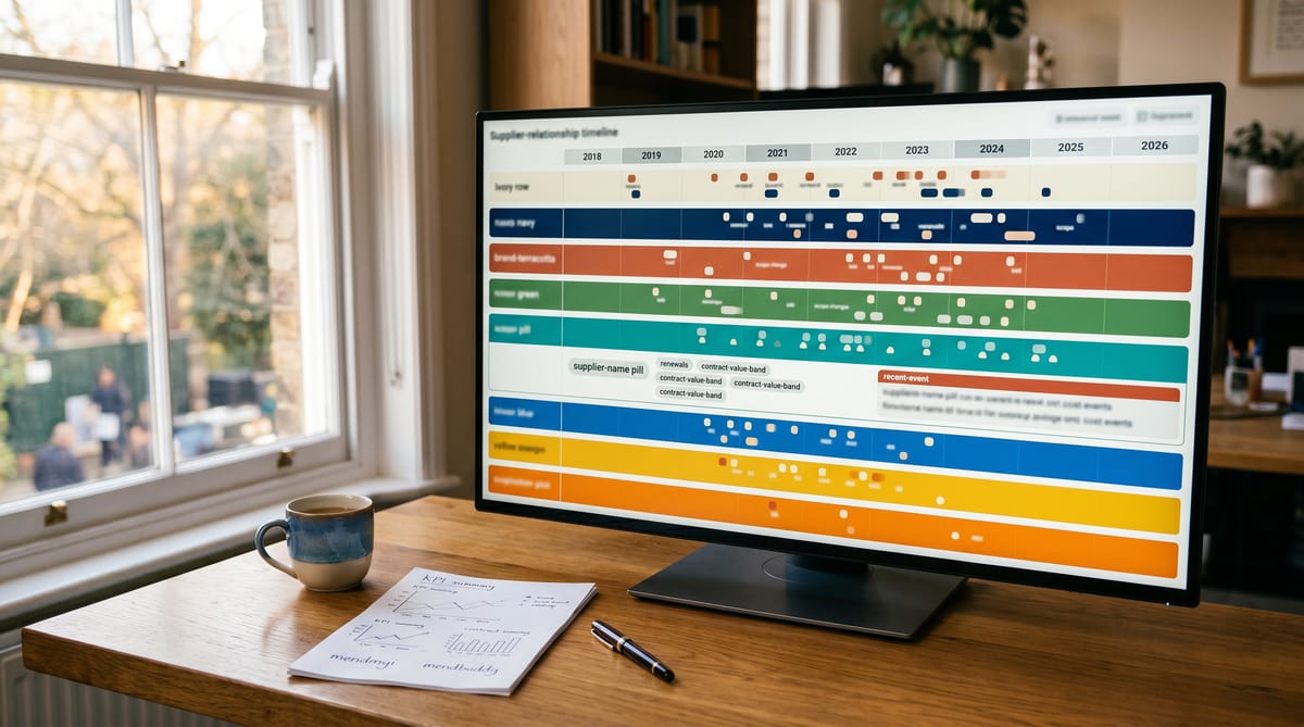
The timeline-and-supplier intelligence layer. The hard problem in the dataset is change over time - supplier relationships open and close, manufacturing footprints shift, regulatory submissions land in waves. The dashboard’s load-bearing view is the per-relationship timeline at every event, chunked for sub-second rendering at scale. The supplier-alert generator runs against the enriched timeline and surfaces decisions: “this supplier just opened a new site in India”, “this company has lost three relationships in 90 days”, “this submission is a first-of-kind for this dosage form”. The analyst gets the alert; the partner gets the alert plus a one-click pivot into the supplier’s full lifecycle.
Audit-trail by default. Every operational event captured at every state transition - supplier created, relationship opened, submission filed, site opened, supplier closed - writes to the same enriched timeline. The dashboard isn’t shadowing the data; it is the readout of the data. When the underlying enrichment pipeline ships a new column, the dashboard surfaces it without a separate reporting database. That audit-trail engine is the reference shape for the compliance evidence record solution applied to operational rather than regulatory data.
Backend and dashboard moving together. The consultancy’s enrichment work and the dashboard-side updates live in lockstep - every schema change has a corresponding dashboard-side change in the same release. “Backend has changed, dashboard is being updated to match” is the documented cadence, not an afterthought that becomes an outage.
The outcome
The consultancy’s deliverable changed shape. Instead of a Word document and a screenshot at the end of an engagement, the client gets a per-client URL into the dashboard with the views their decision-makers need (manufacturing map, supplier lifecycle timeline, alert feed, comparison matrix) pre-built against the enriched data. The engagement deepens when the dashboard becomes the surface clients log into during the month, not just at the end of the quarter. The relationship-length metric extends because the dashboard is the relationship.
For our catalogue, this is the cleanest reference for any vertical where the answer the buyer wants is the dashboard, not the data, and not the analyst-as-a-service. Operational data captured at every state transition, with the per-stakeholder readout as the surface, is a pattern we reuse across accountants doing practice KPIs and partner-side margin-per-client, clinics doing treatment-plan outcomes and per-clinician productivity, recruiters and HR doing pipeline coverage and time-to-fill and placement margin, professional services doing per-project profitability and retainer-scope and time-to-bill, construction doing programme-vs-plan and stage-payment-and-retention and per-project margin, agriculture doing multi-entity diversified-estate consolidation (farm Ltd + venue Ltd + holiday-let sole-trader rolled into one P&L), lettings doing portfolio yield and void-rate and arrears-aging, ecommerce doing multi-channel margin and per-SKU contribution, and domiciliary care doing carer-retention signals alongside multi-LA invoicing reconciliation.
The dashboard layer is what we’d build for a new client whose data is good but whose answer isn’t yet a screen.

Which verticals this fits
Generic capability proof - the dashboard layer over operational data - referenced from almost every hub on the site:
Regulated and professional services
- Accountantspractice KPIs, partner-side margin-per-client
- Solicitorsmatter-pipeline coverage, partner-side WIP
- Clinicstreatment-plan outcomes, per-clinician productivity
- Recruiters and HRpipeline coverage, time-to-fill, placement margin
- Professional servicesper-project profitability, retainer-scope
- Constructionprogramme-vs-plan, stage-payment-and-retention ledger, per-project margin
- Domiciliary carecarer-retention signal, multi-LA invoicing reconciliation
- Charitiessupporter cohort views, restricted-fund tracking
Local and specialist businesses
- Lettingsportfolio yield, void-rate, arrears-aging
- Ecommercemulti-channel margin, per-SKU contribution
- Agriculturemulti-entity diversified-estate consolidation
Which problems this solves
This dashboard is the live example for the operational-data solutions in the catalogue:
- Job Cost & Margin Dashboardoperational data in, decision dashboard out
- Client Onboarding & Intakepartner / manager view of the intake pipeline
- Quote & Chase Ladderdecision view over every quote-state transition
- Invoice & Dunning Ladderdecision view over every invoice-state transition
- Compliance Evidence Recordthe audit-trail-by-default engine applied to operational data
- Multi Channel VAT & CIS Invoicingper-channel and per-entity consolidation
- Customer & Third Party Portalper-stakeholder visibility on operational data
Want a custom dashboard like this for your business?
Tell us what the one-screen view is that you wish you had - the one that currently lives in a spreadsheet someone runs on Sunday evening, or in a sharing link nobody opens because the columns drift, or in a Word document attached to last quarter’s review. Tell us what feeds it (the systems you already run that we’d leave alone) and who looks at it (the partner, the operations manager, the site PM, the carer-team lead, the FD). We’ll come back with a sketch of what we’d build, what data feeds it, and what the decision-makers’ view would look like. No demo, no calendar widget - email reply, scoped sketch, you decide.